Thiyanish KChengalpattu / Tamil Nadu

Graphic Designer / UI·UX Designer

Available for opportunities

Thiyanish K.

Local insight. Clear design.

B.Sc. Computer Science candidate designing useful Indian digital products, Tamil-led identities and considered visual systems.

LocationChengalpattu, TN
Portfolio07 concept studies
FocusProduct / Identity

Selected work

07 self-initiated concept studies / India / 2026

04

UI/UX studies

Complete mobile flows with six key screens each.

03

Graphic studies

Identity, campaign and packaging systems.

07

Detailed boards

Tamil-led, India-focused presentation work.

01 / UI·UX / FINTECH

KAASU

காசு

Self-initiated concept case study

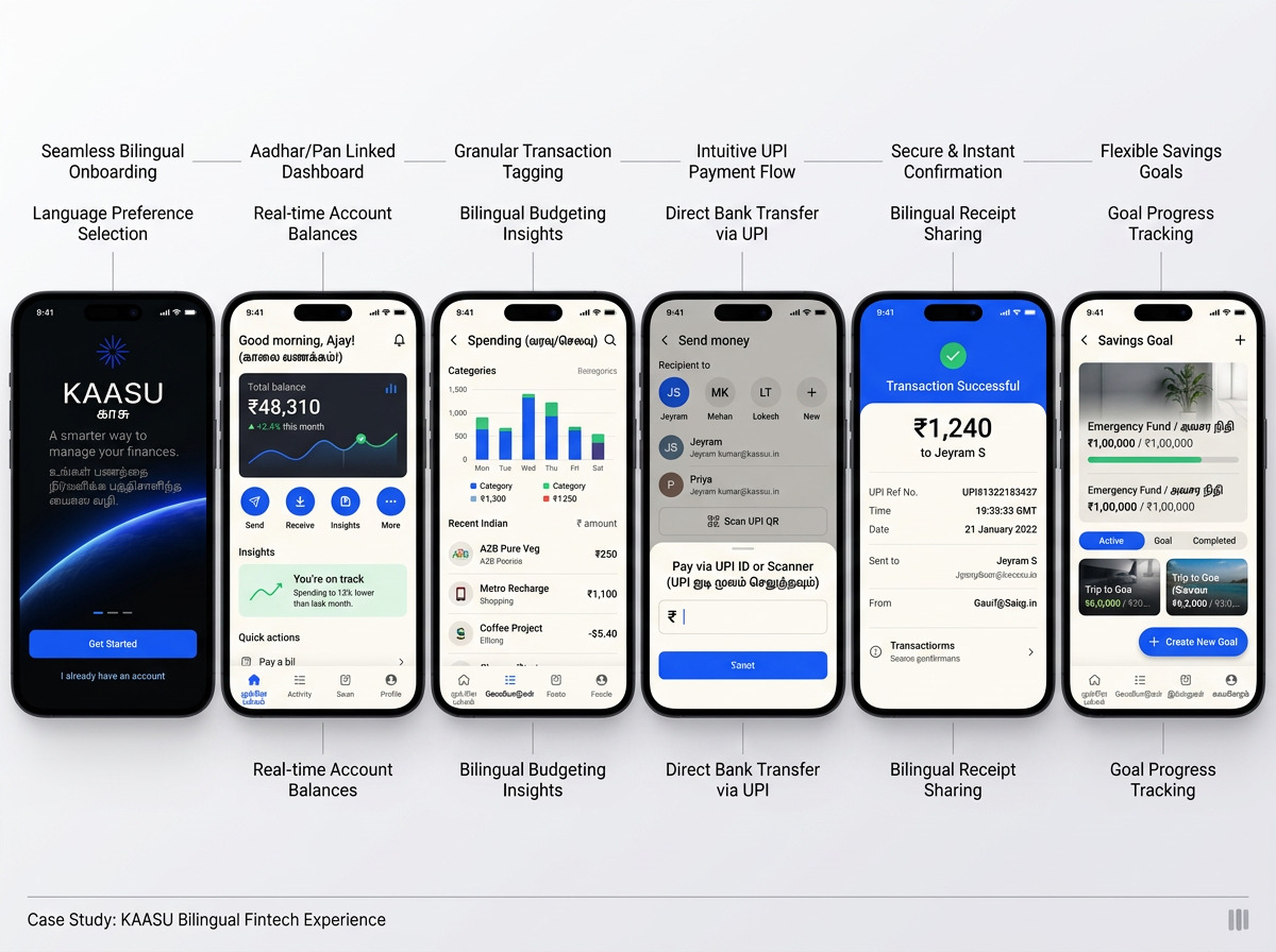
A polished bilingual personal-finance experience that helps young Indian professionals understand spending, complete UPI transfers and build practical savings habits.
Audience
Young professionals
Screens
06 complete screens
Core flow
UPI / savings
Language
English / Tamil
Six KAASU Indian fintech mobile app screens with rupee values and Tamil details

Challenge / design response

Finance apps often expose too much information at once. KAASU uses one clear task per screen, familiar UPI language, rupee-first summaries and consistent bilingual patterns to make everyday money decisions easier.

“Everyday finance, made clear”

Process / outputs

01

Frame

UX architecture

02

Structure

Six-screen UI

03

Transact

UPI interaction

04

Systemise

Component library
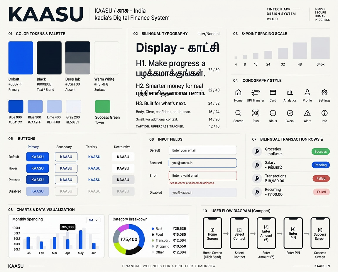
KAASU design system showing colour, type, spacing, components and accessibility

02 / UI·UX / CIVIC MOBILITY

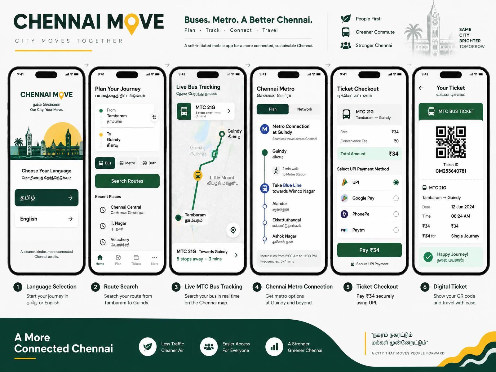
CHENNAI MOVE

சென்னை நகர்வு

Self-initiated concept case study

A connected journey planner for Chennai buses and Metro, designed around real local routes, bilingual wayfinding and simple UPI ticketing.

Route
Tambaram → Guindy
Screens
06 complete screens
Focus
Transit clarity
Fare
₹34 concept fare
Six Chennai Move public transport app screens

Challenge / design response

Daily commuters switch between services and sources of information. A single journey flow connects route search, live MTC tracking, Metro interchange and a ₹34 digital ticket.

“One city, one journey”

Process / outputs

01

Plan

Journey map

02

Track

Route search

03

Connect

Live tracking

04

Travel

Ticket flow

03 / UI·UX / FOOD DELIVERY

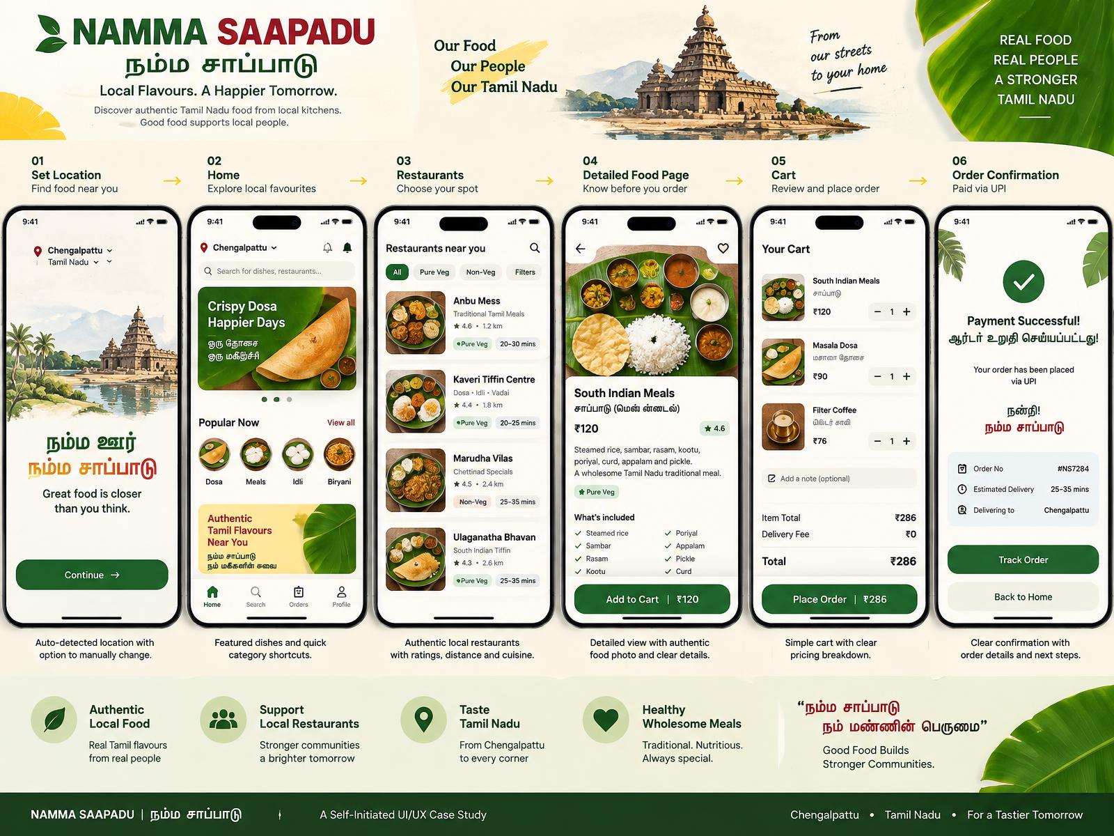
NAMMA SAAPADU

நம்ம சாப்பாடு

Self-initiated concept case study

A Tamil-first local food discovery experience connecting people in Chengalpattu with independent restaurants and familiar everyday meals.

Location
Chengalpattu
Screens
06 complete screens
Basket
₹286 concept order
Language
Tamil / English
Six Namma Saapadu Tamil food discovery and ordering app screens

Challenge / design response

Generic food platforms often flatten regional identity. This concept makes dish type, kitchen story, dietary details and a clear ₹286 basket central to the ordering experience.

“Local food, clearly found”

Process / outputs

01

Discover

Research framing

02

Compare

Food discovery

03

Choose

Cart flow

04

Order

Bilingual UI

04 / UI·UX / MARKETPLACE

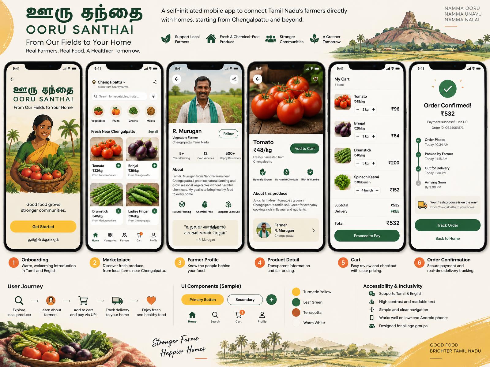
OORU SANTHAI

ஊரு சந்தை

Self-initiated concept case study

A farm-to-home marketplace concept connecting Tamil Nadu growers directly with families, beginning with the Chengalpattu region.

Audience
Families / growers
Screens
06 complete screens
Order
₹532 concept basket
Focus
Trust / access
Six Ooru Santhai local produce marketplace screens with user journey and components

Challenge / design response

Trust matters when buying fresh produce online. Farmer profiles, source locations, price-per-kilogram and a visible delivery timeline bring people and provenance into the purchase flow.

“From fields to homes”

Process / outputs

01

Explore

Marketplace UX

02

Meet

Farmer profile

03

Add

Product detail

04

Receive

Accessible UI

05 / GRAPHIC / EVENT IDENTITY

CHENNAI DESIGN WEEK

சென்னை வடிவமைப்பு வாரம்

Self-initiated concept case study

A bilingual identity for a fictional design gathering, combining kolam logic, Chennai street character and a modular system built for culture at city scale.

System
Bilingual identity
Assets
12+ applications
Format
Print / digital
Inspiration
Kolam / street type
Chennai Design Week identity across posters, programme, badge, social media, tote and billboard

Challenge / design response

The identity needed to feel rooted without becoming nostalgic. Geometric symbols, direct typography and a four-colour system move consistently from programme pages to social tiles and outdoor media.

“Tradition, drawn forward”

Process / outputs

01

Research

Identity mark

02

Symbol

Poster series

03

System

Event kit

04

Campaign

Outdoor system

06 / GRAPHIC / FESTIVAL CAMPAIGN

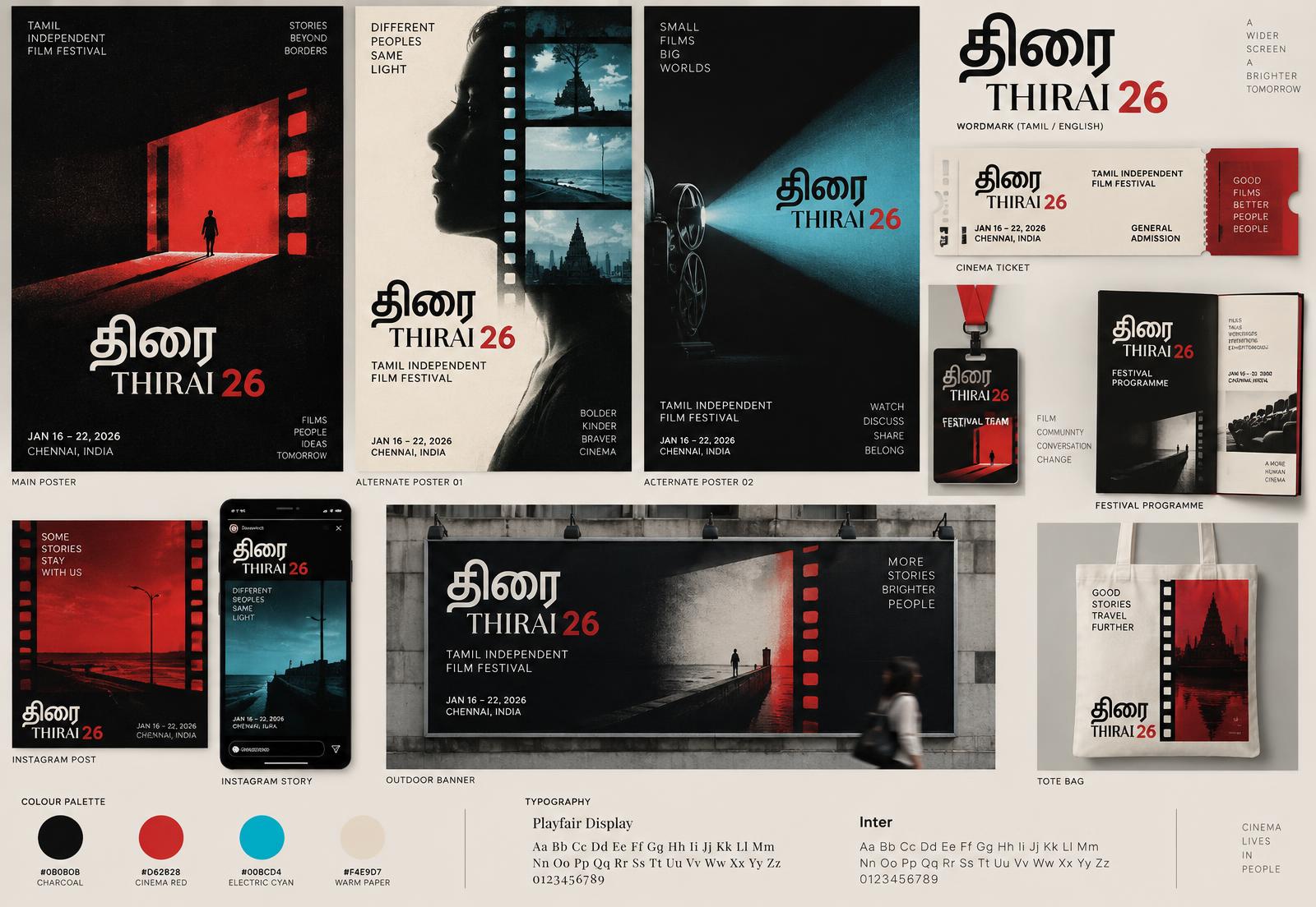
THIRAI 26

திரை

Self-initiated concept case study

A complete campaign for a fictional Tamil independent film festival, using the frame, projector beam and cinematic contrast as one flexible visual language.

Campaign
03 key posters
Assets
10 applications
Format
Print / social
Palette
Red / cyan / ink
Thirai Tamil film festival poster campaign, tickets, badge, programme, social media and outdoor banner

Challenge / design response

A festival must hold many stories without losing recognition. The system keeps a strong wordmark and frame device while photography, scale and light create variation across each application.

“Stories beyond borders”

Process / outputs

01

Theme

Tamil wordmark

02

Frame

Poster family

03

Sequence

Festival kit

04

Release

Social campaign

07 / GRAPHIC / PACKAGING

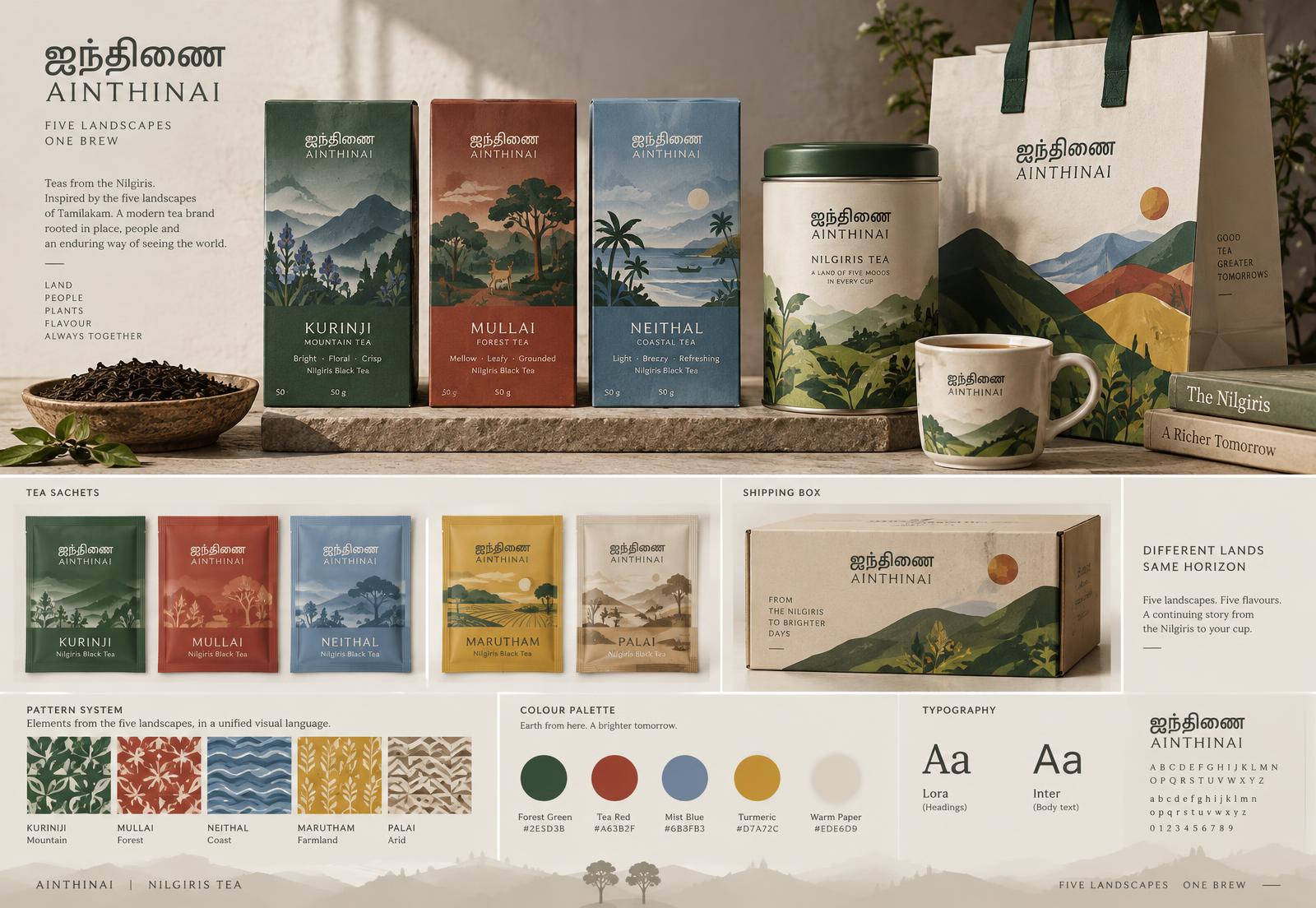
AINTHINAI

ஐந்திணை

Self-initiated concept case study

A Nilgiris tea identity inspired by Tamil literature’s five landscapes, translated into a contemporary family of packs, patterns and retail touchpoints.

Range
05 landscape teas
Assets
11 applications
Format
Pack / retail
Language
Tamil / English
Ainthinai Nilgiris tea packaging, sachets, tin, bag, shipping box, patterns and typography

Challenge / design response

The range needed variety without fragmentation. Landscape-led illustration and one shared grid give each tea its own place, colour and mood while keeping the family recognisable.

“Five landscapes, one brew”

Process / outputs

01

Place

Brand strategy

02

Palette

Packaging family

03

Pack

Illustration

04

Extend

Pattern system

02 / Profile

CORE
CURRICULUM

My computer science foundation shapes how I approach design: understand the system, establish clear rules, and make every decision useful to people.

Download full resume

Education

B.Sc. Computer Science

SRM Institute of Science and Technology

2023 — 2026

Design focus

Mobile UI systems

Tamil visual identity

Typography & layout

Packaging design

Technical

HTML / CSS

Python basics

Git / GitHub

VS Code

Workflow

Research framing

Wireframes

Visual systems

Presentation

03 / Contact

Open to work

Let’s make useful work look unforgettable.

Available for entry-level Graphic Design and UI/UX Design roles, internships and collaborative projects.

Chengalpattu, Tamil Nadu · Open to Chennai and remote